Material Components: ShapeとBottomSheetDialogとMaterialButton
Updated at Tue, Nov 26, 2019Shapeがmaterial androidの1.1.0-alpha01から実装されました。
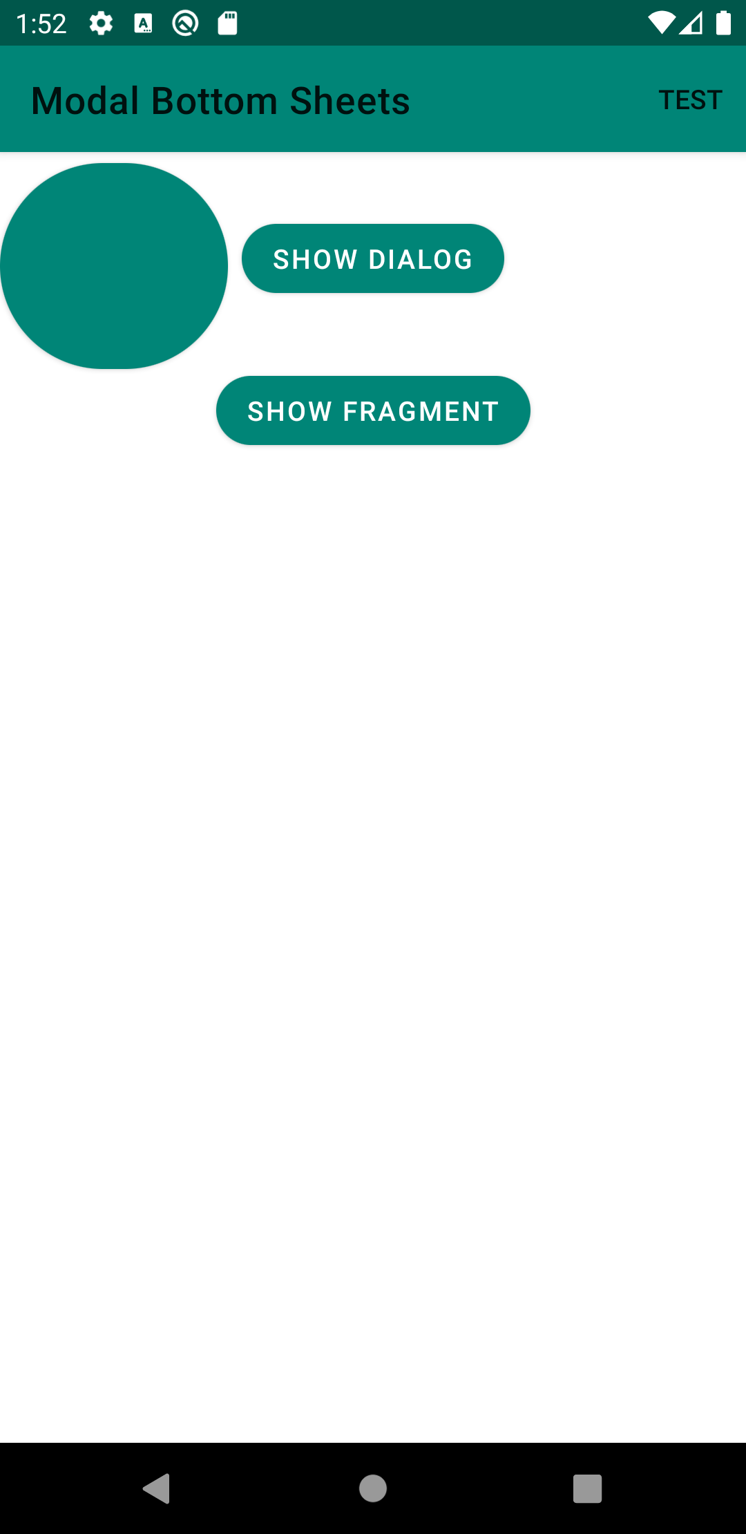
Shapeとは、こんなやつです。
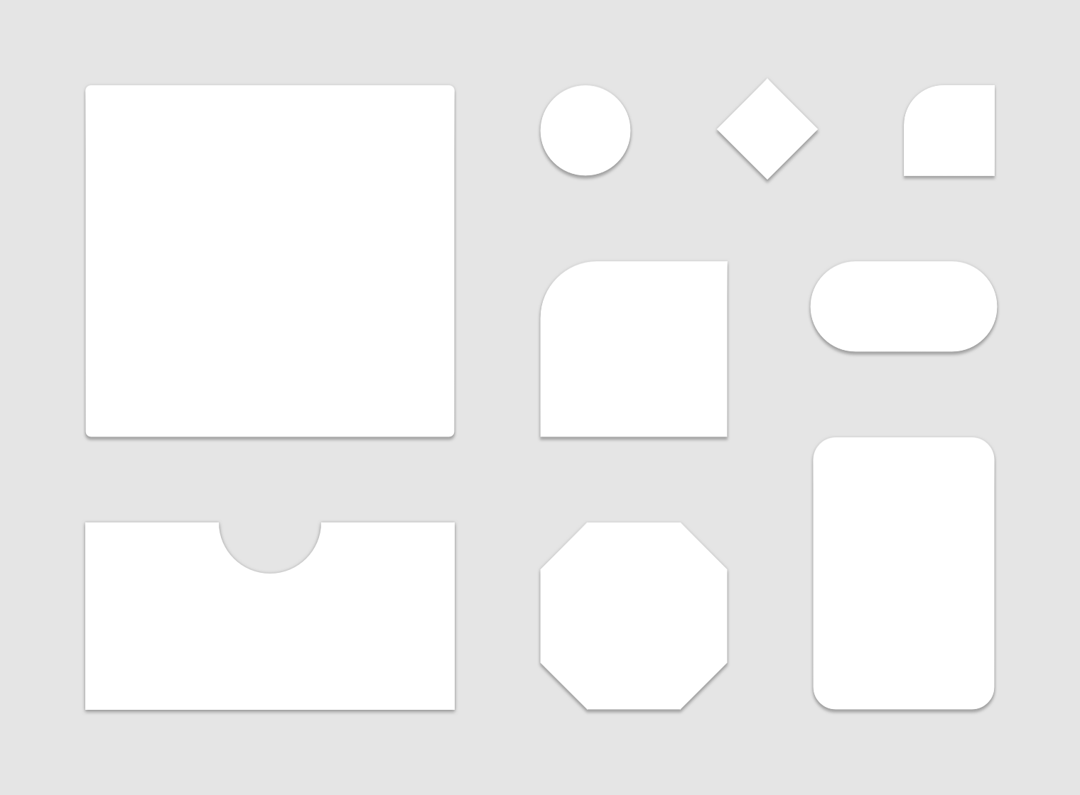
参照: About shape
この記事では、BottomSheetDialogとMaterialButtonを参考に、Shapeをどのように設定するかを説明します。
より詳しい説明は公式ドキュメント/Shape.mdを参照してください。
まずはテーマを設定する
Theme.MaterialComponentsを使う必要があります。
- Theme.MaterialComponents.Light
- Theme.MaterialComponents.DayNight
などをテーマに指定します。
<style name="AppTheme" parent="Theme.MaterialComponents.DayNight">
...
こんな感じです。
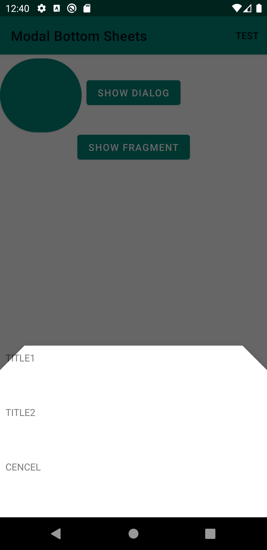
準備は終わったので、BottomSheetDialogにShapeを適用してみます。
BottomSheetDialogにShapeを指定していく
(多分)大きく3つの指定方法があります。
shapeAppearanceLargeComponentを指定するbottomSheetDialogThemeを指定する- 独自でテーマを作り、BottomSheetDialogの引数などから与える
shapeAppearanceLargeComponentを指定する
デフォルトだとBottomSheetDialogのスタイルとして、@style/Widget.MaterialComponents.BottomSheet.Modalを使うようになっています。
このスタイルの定義は、次のようになっています。
<style name="Widget.MaterialComponents.BottomSheet.Modal" parent="Widget.MaterialComponents.BottomSheet">
...

<style name="Widget.MaterialComponents.BottomSheet" parent="Widget.Design.BottomSheet.Modal">
  ...
  <item name="shapeAppearance">?attr/shapeAppearanceLargeComponent</item>
  ...
</style>
shapeAppearanceに、?attr/shapeAppearanceLargeComponentが使われています。shapeAppearanceは、Shapeの設定を流し込む部分です。
なので、これを変えればBottomSheetDialogのShapeを変える事ができます。
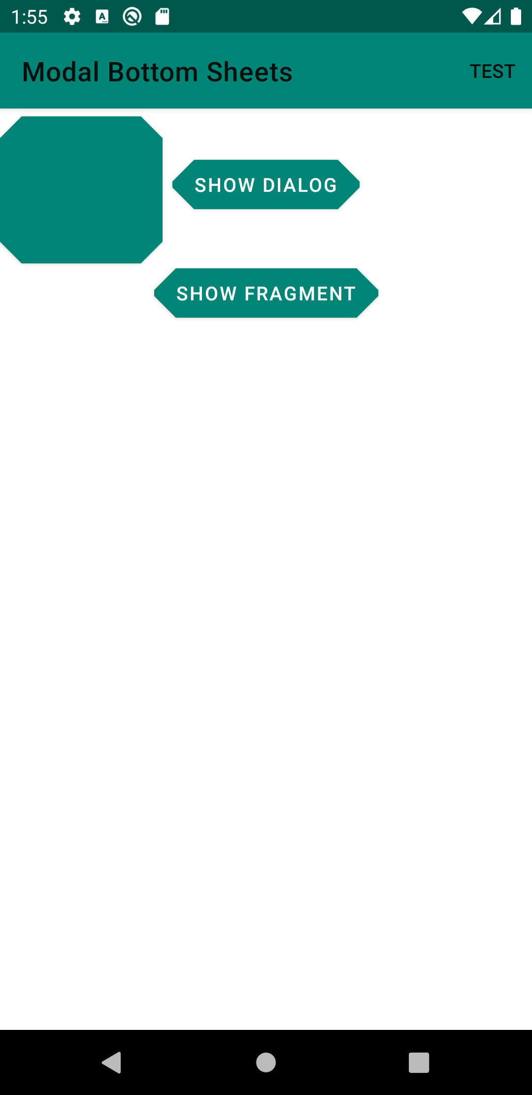
たとえば、次のように設定してみます。
<style name="AppTheme" parent="Theme.MaterialComponents.DayNight">
  <!-- ?attr/shapeAppearanceLargeComponentの設定 -->
  <item name="shapeAppearanceLargeComponent">@style/ShapeAppearance.Sample.LargeComponent</item>
</style>

<style name="ShapeAppearance.Sample.LargeComponent" parent="">
  <item name="cornerFamily">cut</item>

  <!-- 各corner(top right, top left, bottom left, bottom right)のサイズを指定 -->
  <item name="cornerSize">36dp</item>
</style>
こんな感じになります。
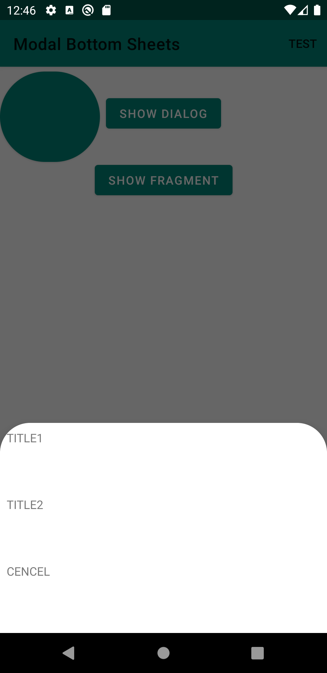
cornerFamilyにはcut以外にも、roundedを取ることが出来ます。roundedを指定すると次のようになります。
<style name="ShapeAppearance.Sample.LargeComponent" parent="">
  <item name="cornerFamily">rounded</item>

  <item name="cornerSize">36dp</item>
</style>
shapeAppearanceLargeComponentを指定することは、BottomSheetDialog以外の、他のコンポーネントにも影響が出るので、注意してください。
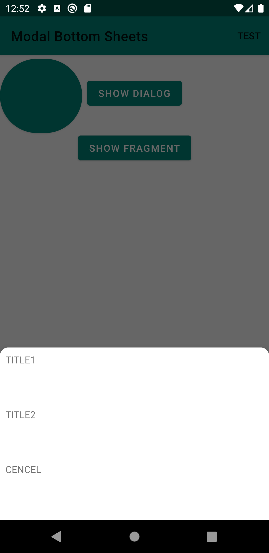
bottomSheetDialogThemeを指定する
bottomSheetDialogThemeから、BottomSheetDialogのShapeの設定を変えることも出来ます。
<style name="AppTheme" parent="Theme.MaterialComponents.DayNight">
  ...
  <item name="bottomSheetDialogTheme">@style/ShapeCustomBottomSheetDialog</item>
</style>

<style name="ShapeCustomBottomSheetDialog" parent="ThemeOverlay.MaterialComponents.BottomSheetDialog">
  <item name="bottomSheetStyle">@style/Widget.Sample.BottomSheetDialog</item>
</style>

<style name="Widget.Sample.BottomSheetDialog" parent="Widget.MaterialComponents.BottomSheet.Modal">
  <!-- コンポーネントごとの個別の変更の場合、shapeAppearanceOverlayを使う -->
  <item name="shapeAppearanceOverlay">@style/ShapeAppearanceOverlay.Sample.Basic</item>
</style>

<style name="ShapeAppearanceOverlay.Sample.Basic" parent="">
  <!-- cornerは、個別に指定することも可能 -->
  <item name="cornerSizeTopRight">12dp</item>
  <item name="cornerSizeTopLeft">12dp</item>
</style>
こんな感じになります。
BottomSheetDialogはこんな感じで、StyleからShapeを指定することが出来ます。
MaterialButtonにShapeを指定していく
(多分)大きく2つの指定方法があります。
shapeAppearanceSmallComponentを指定する- Shape用のスタイルを作り、MaterialButtonの引数、XMLの定義などから与える
shapeAppearanceSmallComponentを指定する
MaterialButtonは、デフォルトではWidget.MaterialComponents.Buttonスタイルを使うようになっています。
これは、次のように定義されています。
<style name="Widget.MaterialComponents.Button" parent="Widget.AppCompat.Button">
  ...
  <item name="shapeAppearance">?attr/shapeAppearanceSmallComponent</item>
</style>
shapeAppearanceに、?attr/shapeAppearanceSmallComponentが使われています。先程と同様に、これを指定することで、Shapeの振る舞いを変えることが出来ます。
次のように設定してみます。
<style name="AppTheme" parent="Theme.MaterialComponents.DayNight">
  <item name="shapeAppearanceSmallComponent">@style/ShapeAppearance.Sample.SmallComponent</item>
</style>

<style name="ShapeAppearance.Sample.SmallComponent" parent="">
  <item name="cornerFamily">rounded</item>

  <item name="cornerSize">50%</item>
</style>
こんな感じになります。
XMLから直接指定する
次のように、直接XMLから指定することも出来ます。XMLから直接指定する場合は、shapeAppearanceOverlayから指定します。
<style name="shapeAppearanceOverlay.Sample.MediumComponent" parent="">
  <item name="cornerFamily">cut</item>

  <item name="cornerSize">16dp</item>
</style>

<com.google.android.material.button.MaterialButton
  android:layout_width="wrap_content"
  android:layout_height="wrap_content"
  android:text="Show Dialog"
  app:shapeAppearanceOverlay="@style/shapeAppearanceOverlay.Sample.MediumComponent" />
こんな感じになります。
まとめ
- テーマから指定するやり方と、XMLなどから直接指定するやり方がある
- 個別にやる場合は、
shapeAppearanceOverlayから変更する
- 個別にやる場合は、
- テーマから指定すると全部一気に変えられるので便利😃
- ただし、
?attr/shapeAppearanceSmallComponentを上書きする方法だと、他のコンポーネントにも影響が出るので、慎重に- 例えば、Chipはデフォルトだと
shapeAppearanceSmallComponentで定義されています
- 例えば、Chipはデフォルトだと
- ただし、
修正
瀬戸さんから、Twitterで、ご指摘を頂いたんですが、
個別にコンポーネントに対して、Shapeの指定をするときは、Shape Themingにもある通り、shapeAppearanceOverlayから指定するのが正しいです。
ご指摘ありがとうございます😊